『Rによる数値生態学』(原著“Numerical Ecology with R, 2nd Edition”)のグラフは基本的にbase graphicsで描かれています。このうち第2章「探索的データ解析」のものを、勉強のためggplot2(とpatchwork)で描いてみようと思いました。
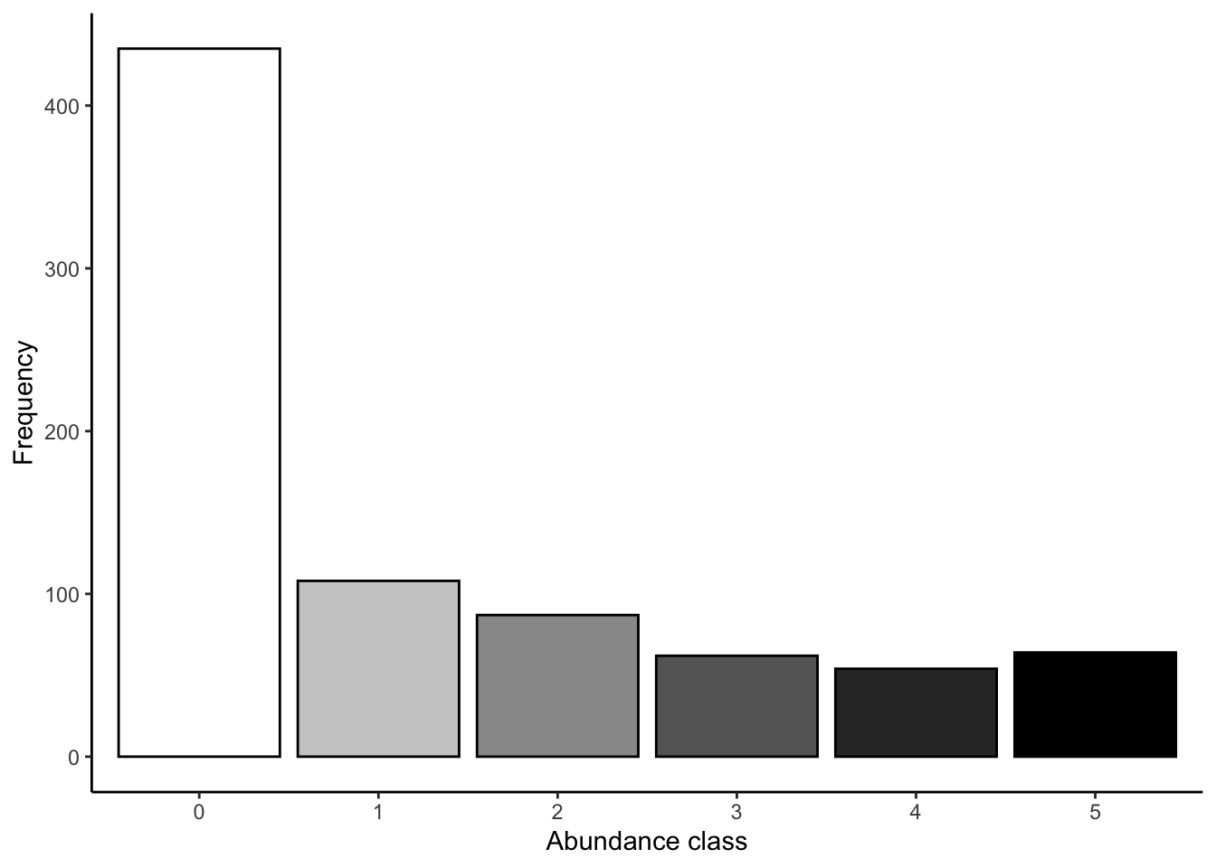
図 2.1
abは、各クラスの頻度の値がはいっているtableです。geom_colを使用します。
data.frame(class = names(ab), ab = c(ab)) |>
  ggplot(aes(x = class, y = ab, fill = class)) +
  geom_col(colour = "black") +
  scale_x_discrete(limits = names(ab)) +
  scale_fill_manual(values = gray(5:0 / 5)) +
  labs(x = "Abundance class",
       y = "Frequency") +
  theme_classic() +
  theme(legend.position = "none")
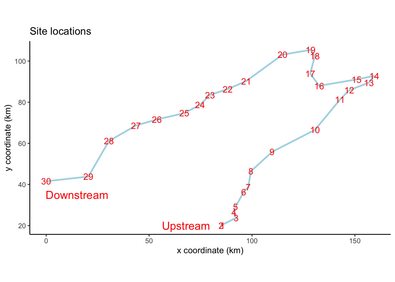
図 2.2
サンプリングサイトの位置図です。geom_pathで座標をつなげていきます。
spaは、X座標とY座標のデータフレームですが、rownamesがサイト番号になっていますので、これを新しい列にしておきます。
spa$Site <- rownames(spa)
ggplot(spa, aes(x = X, y = Y)) +
  geom_path(color = "light blue", linewidth = 1) +
  geom_text(aes(label = Site), color = "red", size = 4) +
  annotate("text", x = 68, y = 20, label = "Upstream",
           size = 5, color = "red") +
  annotate("text", x = 15, y = 35, label = "Downstream",
           size = 5, color = "red") +
  labs(title = "Site locations",
       x = "x coordinate (km)",
       y = "y coordinate (km)") +
  coord_fixed() +
  theme_classic()
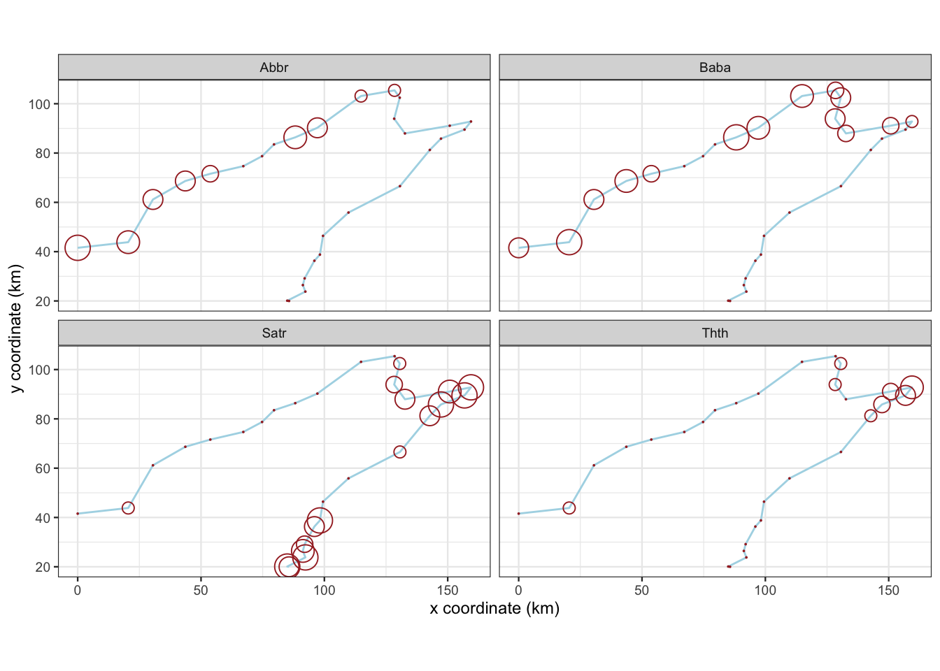
図 2.3
魚類4種のアバンダンスのバブルマップです。
speは、各サイト(行)における各魚種(列)のアバンダンスクラスを格納したデータフレームです。spaと結合して、pivot_longerで整然データ(Tidy data)にしています。
spe_tidy <- spa |>
  dplyr::bind_cols(spe) |>
  tidyr::pivot_longer(cols = Cogo:Anan,
                      names_to = "Species",
                      values_to = "Abundance")
spe_tidy|>
  dplyr::filter(Species %in% c("Satr", "Thth", "Baba", "Abbr")) |>
  ggplot(aes(x = X, y = Y)) +
  geom_path(color = "light blue") +
  geom_point(aes(size = Abundance),
             color = "brown", shape = 1, na.rm = TRUE) +
  scale_size(range = c(0, 6)) +
  labs(x = "x coordinate (km)",
       y = "y coordinate (km)") +
  coord_fixed() +
  facet_wrap(~Species, ncol = 2) +
  theme_bw(base_size = 9) +
  theme(legend.position = "none")
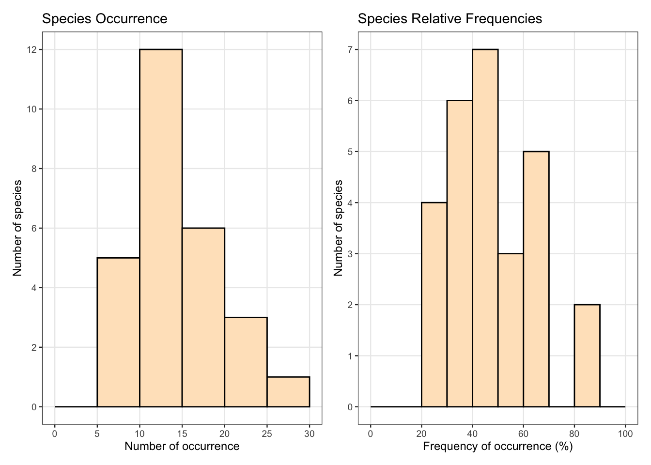
図 2.4
geom_histogramでヒストグラムを描画します。closed = "left"で、hist(right = FALSE)と同じになるようにしています。
patchworkを使って、グラフを並べています。
spe_pres <- spe_tidy |>
  dplyr::group_by(Species) |>
  dplyr::summarise(pres = sum(Abundance > 0))

p1 <- ggplot(spe_pres, aes(x = pres)) +
  geom_histogram(breaks = seq(0, 30, by = 5), closed = "left",
                 fill = "bisque", colour = "black") +
  scale_x_continuous(breaks = seq(0, 30, by = 5),
                     minor_breaks = NULL) +
  scale_y_continuous(breaks = seq(0, 12, by = 2),
                     minor_breaks = NULL) +
  labs(title = "Species Occurrence",
       x = "Number of occurrence",
       y = "Number of species") +
  theme_bw(base_size = 9)

p2 <- spe_pres |>
  dplyr::mutate(relf = 100 * pres / nrow(spe)) |>
  ggplot(aes(x = relf)) +
  geom_histogram(breaks = seq(0, 100, by = 10), closed = "left",
                 fill = "bisque", colour = "black") +
  scale_x_continuous(breaks = seq(0, 100, by = 20),
                     minor_breaks = NULL) +
  scale_y_continuous(breaks = seq(0, 7, by = 1),
                     minor_breaks = NULL) +
  labs(title = "Species Relative Frequencies",
       x = "Frequency of occurrence (%)",
       y = "Number of species") +
  theme_bw(base_size = 9)

p1 + p2
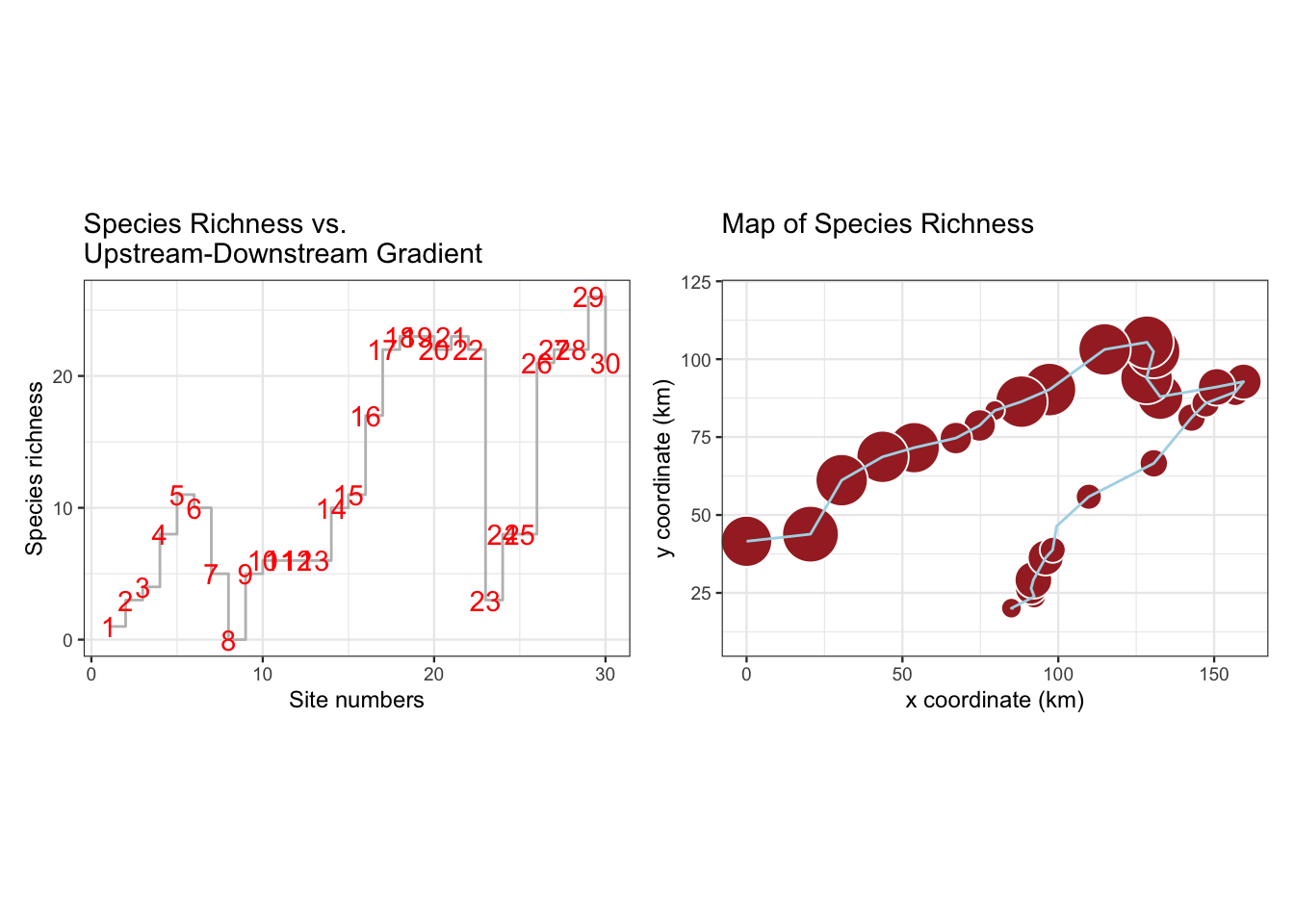
図 2.5
sprchには、種の豊富さ(出現種数)を入れています。左側のグラフでは、gem_stepを使用しています。
sprch <- spe_tidy |>
  dplyr::mutate(Present = (Abundance > 0)) |>
  dplyr::group_by(Site) |>
  dplyr::summarise(Species_richness = sum(Present))

p1 <- ggplot(sprch, aes(x = as.numeric(Site), y = Species_richness)) +
  geom_step(color = "gray") +
  geom_text(aes(label = Site), colour = "red") +
  labs(title = "Species Richness vs. \nUpstream-Downstream Gradient",
       x = "Site numbers",
       y = "Species richness") +
  theme_bw(base_size = 9)

p2 <- dplyr::left_join(spa, sprch, by = "Site") |>
  ggplot(aes(x = X, y = Y)) +
  geom_point(aes(size = Species_richness), shape = 21,
             fill = "brown", colour = "white") +
  scale_size(range = c(0, 10)) +
  geom_path(color = "light blue", linewidth = 0.5) +
  scale_y_continuous(limits = c(10, 120)) +
  labs(title = "Map of Species Richness",
       x = "x coordinate (km)",
       y = "y coordinate (km)") +
  coord_fixed() +
  theme_bw(base_size = 9) +
  theme(legend.position = "none")

p1 + p2
各種変換した値をspenv_tidyにまとめます。
spenv_tidy <- dplyr::bind_cols(
  spe |>
    dplyr::mutate(Site = rownames(spe)) |>
    tidyr::pivot_longer(-Site,
                         names_to = "Species",
                         values_to = "raw"),
  spe.pa |>
    tidyr::pivot_longer(everything(),
                        values_to = "pa") |>
    dplyr::select(pa),
  spe.scal |>
    tidyr::pivot_longer(everything(),
                        values_to = "scal") |>
    dplyr::select(scal),
  spe.relsp |>
    tidyr::pivot_longer(everything(),
                        values_to = "relsp") |>
    dplyr::select(relsp),
  spe.rel |>
    tidyr::pivot_longer(everything(),
                        values_to = "rel") |>
    dplyr::select(rel),
  spe.norm |>
    tidyr::pivot_longer(everything(),
                        values_to = "norm") |>
    dplyr::select(norm),
  spe.hel |>
    tidyr::pivot_longer(everything(),
                        values_to = "hel") |>
    dplyr::select(hel),
  spe.chi |>
    tidyr::pivot_longer(everything(),
                        values_to = "chi") |>
    dplyr::select(chi),
  spe.wis |>
    tidyr::pivot_longer(everything(),
                        values_to = "wis") |>
    dplyr::select(wis)
  )
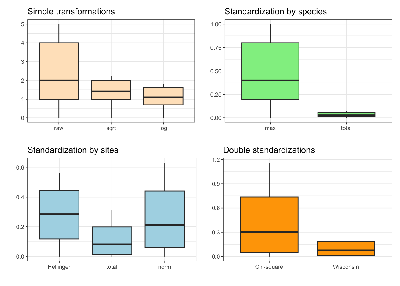
図 2.6
箱ひげ図です。これもpatchworkでまとめています。
p1 <- spenv_tidy |>
  dplyr::filter(Species == "Babl") |>
  dplyr::mutate(raw,
                sqrt = sqrt(raw),
                log = log1p(raw),
                .keep = "none") |>
  tidyr::pivot_longer(everything()) |>
  dplyr::mutate(name = factor(name,
                              levels = c("raw", "sqrt", "log"))) |>
  ggplot(aes(x = name, y = value)) +
    geom_boxplot(fill = "bisque") +
  labs(title = "Simple transformations", x = "", y = "") +
  theme_bw(base_size = 9)

p2 <- spenv_tidy |>
  dplyr::filter(Species == "Babl") |>
  dplyr::select(scal, relsp) |>
  tidyr::pivot_longer(everything()) |>
  dplyr::mutate(name = factor(name,
                              levels = c("scal", "relsp"))) |>
  ggplot(aes(x = name, y = value)) +
    geom_boxplot(fill = "lightgreen") +
  scale_x_discrete(labels = c("max", "total")) +
  labs(title = "Standardization by species", x = "", y = "") +
  theme_bw(base_size = 9)

p3 <- spenv_tidy |>
  dplyr::filter(Species == "Babl") |>
  dplyr::select(hel, rel, norm) |>
  tidyr::pivot_longer(everything()) |>
  dplyr::mutate(name = factor(name,
                              levels = c("hel", "rel", "norm"))) |>
  ggplot(aes(x = name, y = value)) +
    geom_boxplot(fill = "lightblue") +
  scale_x_discrete(labels = c("Hellinger", "total", "norm")) +
  labs(title = "Standardization by sites", x = "", y = "") +
  theme_bw(base_size = 9)

p4 <- spenv_tidy |>
  dplyr::filter(Species == "Babl") |>
  dplyr::select(chi, wis) |>
  tidyr::pivot_longer(everything()) |>
  dplyr::mutate(name = factor(name,
                              levels = c("chi", "wis"))) |>
  ggplot(aes(x = name, y = value)) +
    geom_boxplot(fill = "orange") +
  scale_x_discrete(labels = c("Chi-square", "Wisconsin")) +
  labs(title = "Double standardizations", x = "", y = "") +
  theme_bw(base_size = 9)

(p1 + p2) / (p3 + p4)
p.28-29のグラフ
ここのグラフは本にはコードだけで、図はありません。
描画するグラフにあわせて、データを変形しています。
env_spa <- env |>
  dplyr::mutate(Site = rownames(env)) |>
  dplyr::left_join(spa, by = "Site")

species_level <- c("Satr", "Thth", "Baba", "Abbr", "Babl")
species_name <- c("Brown trout", "Grayling", "Barbel", "Common bream",
                  "Stone loach")
spenv_dfs <- env_spa |>
  dplyr::select(Site, dfs) |>
  dplyr::left_join(spenv_tidy, by = "Site")

sc <- scale_colour_manual(labels = species_name,
                          values = c(4, 3, "orange", 2, 1))
sl <- scale_linetype_manual(labels = species_name,
                            values = c(rep("solid", 4), "dotted"))

p1 <- spenv_dfs |>
  dplyr::filter(Species %in% species_level) |>
  dplyr::mutate(Species = factor(Species,
                                 levels = species_level)) |>
  ggplot(aes(x = dfs, y = raw)) +
  geom_line(aes(colour = Species, linetype = Species)) +
  labs(title = "Raw data",
       x = "Distance from the source [km]",
       y = "Raw abundance code") +
  sc + sl +
  theme_bw(base_size = 9) +
  theme(legend.position = "none")

p2 <- spenv_dfs |>
  dplyr::filter(Species %in% species_level) |>
  dplyr::mutate(Species = factor(Species,
                                 levels = species_level)) |>
  ggplot(aes(x = dfs, y = scal)) +
  geom_line(aes(colour = Species, linetype = Species)) +
  labs(title = "Species abundances range by maximum",
       x = "Distance from the source [km]",
       y = "Ranged abundance") +
  sc + sl +
  theme_bw(base_size = 9) +
  theme(legend.position = "none")

p3 <- spenv_dfs |>
  dplyr::filter(Species %in% species_level) |>
  dplyr::mutate(Species = factor(Species,
                                 levels = species_level)) |>
  ggplot(aes(x = dfs, y = hel)) +
  geom_line(aes(colour = Species, linetype = Species)) +
  labs(title = "Hellinger-transformed abundances",
       x = "Distance from the source [km]",
       y = "Standardized abundance") +
  sc + sl +
  theme_bw(base_size = 9) +
  theme(legend.position = "none")

p4 <- spenv_dfs |>
  dplyr::filter(Species %in% species_level) |>
  dplyr::mutate(Species = factor(Species,
                                 levels = species_level)) |>
  ggplot(aes(x = dfs, y = chi)) +
  geom_line(aes(colour = Species, linetype = Species)) +
  labs(title = "Chi-square-transformed abundances",
       x = "Distance from the source [km]",
       y = "Standardized abundance") +
  sc + sl +
  theme_bw(base_size = 9) +
  theme(legend.title = element_text(size = 7),
        legend.text = element_text(size = 6),
        legend.key.height = unit(7, "points"),
        legend.position = "inside",
        legend.justification = c(1, 1),
        legend.background = element_rect(colour = "black", linewidth = 0.25))

(p1 + p2) / (p3 + p4)
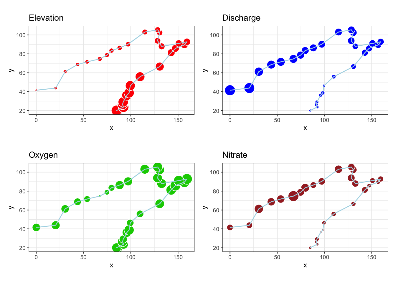
図 2.7
環境条件4変数のバブルマップです。
p1 <- ggplot(env_spa, aes(x = X, y = Y)) +
  geom_point(aes(size = 5 * ele / max(ele)),
             shape = 21, colour = "white", fill = "red") +
  geom_path(colour = "light blue") +
  labs(title = "Elevation", x = "x", y = "y") +
  coord_fixed() +
  theme_bw(base_size = 9) +
  theme(legend.position = "none")

p2 <- ggplot(env_spa, aes(x = X, y = Y)) +
  geom_point(aes(size = 5 * dis / max(dis)),
             shape = 21, colour = "white", fill = "blue") +
  geom_path(colour = "light blue") +
  labs(title = "Discharge", x = "x", y = "y") +
  coord_fixed() +
  theme_bw(base_size = 9) +
  theme(legend.position = "none")

p3 <- ggplot(env_spa, aes(x = X, y = Y)) +
  geom_point(aes(size = 5 * oxy / max(oxy)),
             shape = 21, colour = "white", fill = "green3") +
  geom_path(colour = "light blue") +
  labs(title = "Oxygen", x = "x", y = "y") +
  coord_fixed() +
  theme_bw(base_size = 9) +
  theme(legend.position = "none")

p4 <- ggplot(env_spa, aes(x = X, y = Y)) +
  geom_point(aes(size = 5 * nit / max(nit)),
             shape = 21, colour = "white", fill = "brown") +
  geom_path(colour = "light blue") +
  labs(title = "Nitrate", x = "x", y = "y") +
  coord_fixed() +
  theme_bw(base_size = 9) +
  theme(legend.position = "none")

(p1 + p2) / (p3 + p4)
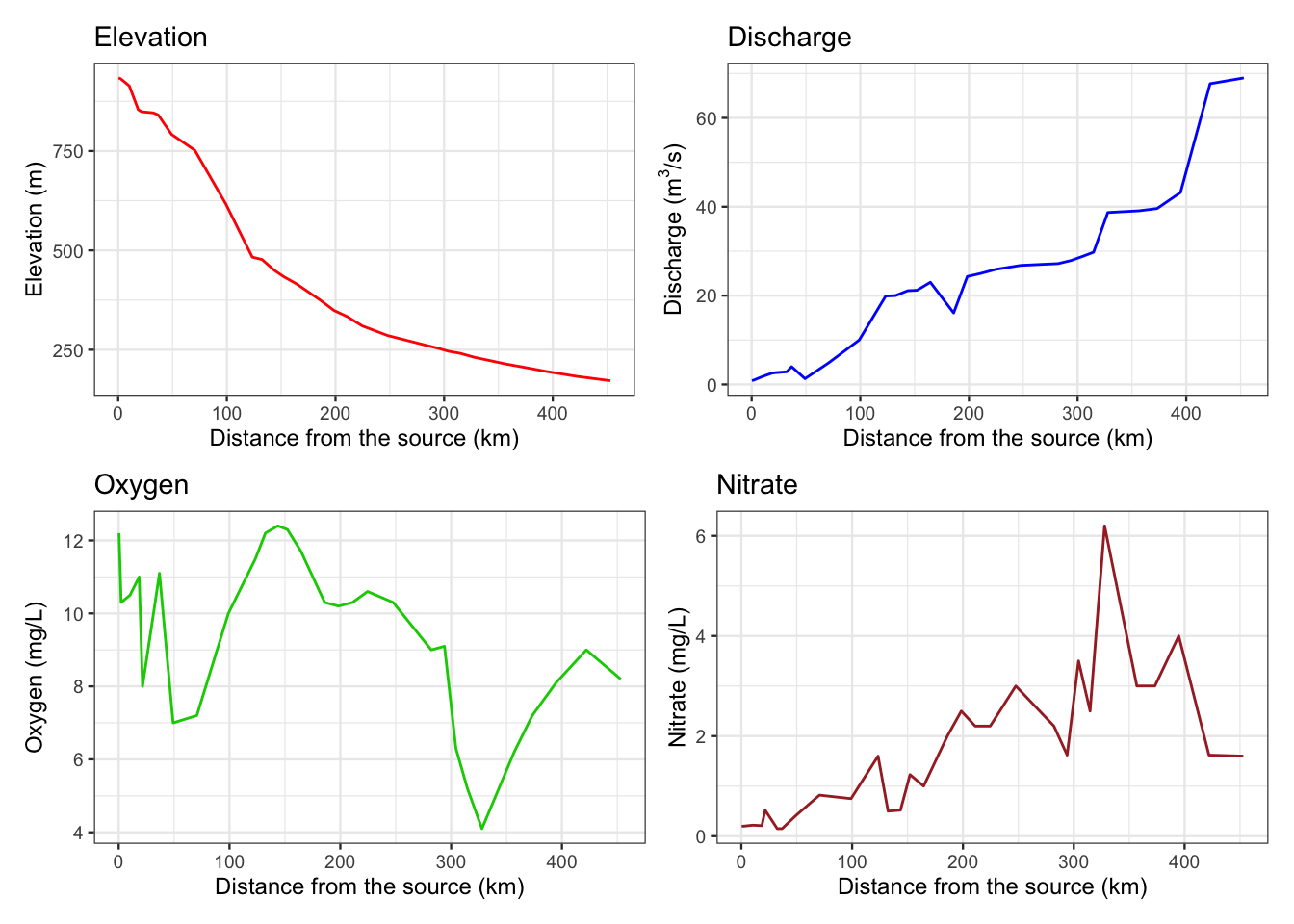
図 2.8
同ラインプロットです。
p1 <- ggplot(env, aes(x = dfs, y = ele)) +
  geom_line(colour = "red") +
  labs(title = "Elevation",
       x = "Distance from the source (km)",
       y = "Elevation (m)")+
  theme_bw(base_size = 9)

p2 <- ggplot(env, aes(x = dfs, y = dis)) +
  geom_line(colour = "blue") +
  labs(title = "Discharge",
       x = "Distance from the source (km)",
       y = expression(paste("Discharge (", m^3, "/s)"))) +
  theme_bw(base_size = 9)

p3 <- ggplot(env, aes(x = dfs, y = oxy)) +
  geom_line(colour = "green3") +
  labs(title = "Oxygen",
       x = "Distance from the source (km)",
       y = "Oxygen (mg/L)") +
  theme_bw(base_size = 9)

p4 <- ggplot(env, aes(x = dfs, y = nit)) +
  geom_line(colour = "brown") +
  labs(title = "Nitrate",
       x = "Distance from the source (km)",
       y = "Nitrate (mg/L)") +
  theme_bw(base_size = 9)

(p1 + p2) / (p3 + p4)