library(lavaan)
## This is lavaan 0.6-19
## lavaan is FREE software! Please report any bugs.ggdiagramという、ダイアグラムを描画するパッケージができたとBlueskyできいたので、試してみました。まずはこれでパス図を書いてみることにしました。
準備
以前、「semパッケージを使用した共分散構造分析」という記事で作成したパス図を再現してみることにします。ということで、まずは共分散構造分析(構造方程式モデリング)です。前回はsemパッケージを使用しましたが、今回はlavaanパッケージを使用しました。
データ
こちらも前回と同じく、豊田秀樹・前田忠彦・柳井晴夫『原因をさぐる統計学』(講談社ブルーバックス, 1992)第3章の、食物とガンとの関係のデータです。読み込んだら、標準化しておきます。
cancer_data <- readr::read_csv("data/Cancer_raw.csv") |>
  # standardize
  apply(2, scale)
## Rows: 47 Columns: 6
## ── Column specification ────────────────────────────────────────────────────────
## Delimiter: ","
## dbl (6): x1, x2, x3, x4, x5, x6
##
## ℹ Use `spec()` to retrieve the full column specification for this data.
## ℹ Specify the column types or set `show_col_types = FALSE` to quiet this message.データ中の変数は。x1-x4が食物供給量、x5-x6が男性のガンの部位別訂正死亡率です。
x1: 総熱量x2: 肉類x3: 乳製品x4: 酒類x5: 大腸ガンx6: 直腸ガン
モデル
多重指標モデルをあてはめます。潜在変数としてxi1(洋食傾向)とeta1(下部消化管のガン傾向)を導入します。
lavaanのモデルは以下になります。
model <- "
  xi1  =~ x1 + x2 + x3 + x4
  eta1 =~ x5 + x6
  eta1 ~  xi1
"
パス図
上のモデルのパス図をggdiagramでを作成します。
ggdiagramパッケージを読み込みます。また、オブジェクトの作成に使用する変数を設定します。
library(ggdiagram)

font_family <- "Helvetica" # Font
label_size <- 18           # Label size
num_size <- 12             # Number size
latent_radius <- 2         # Radius of circle for latent variables
error_radius <- 1          # Radius of circle for error terms
rect_width <- 5            # Width of rectangle
rect_height <- 2.5         # Width of rectangle
rect_sep = 2 # Separation distance between rectangles観測変数x1–x6のオブジェクトをつくります。
ggdiagramでは相対位置で位置を決めることもできるのですが、まだいまひとつ使い方がわかっていないので、絶対位置を指定しています。また、ob_arrayという関数で、オブジェクトの配列をつくることもできるのですが、絶対位置指定との組み合わせ方がよくわかっていないので、purrr::mapでオブジェクトを生成してリストに入れています。
x <- purrr::map(1:6,
                \(i)
                ob_rectangle(
                  width = rect_width,
                  height = rect_height,
                  label = ob_label(label = paste0("x~", i, "~"),
                                   family = font_family,
                                   size = label_size),
                  x = (i - 1) * (rect_width + rect_sep) + 1,
                  y = 4
                )
)潜在変数xi1のオブジェクトをつくります。
xi1 <- ob_circle(
  radius = latent_radius,
  label = ob_label(label = "ξ~1~",
                   family = font_family,
                   size = label_size),
  x = 1.5 * (rect_width + rect_sep) + 1,
  y = 15
)潜在変数eta1のオブジェクトをつくります。
eta1 <- ob_circle(
  radius = latent_radius,
  label = ob_label(label = "η~1~",
                   family = font_family,
                   size = label_size),
  x = 4.5 *  (rect_width + rect_sep) + 1,
  y = 15
)誤差項zeta1のオブジェクトです。誤差項は円にしていますが、linewidth = 0として線を描画しないようにしています。
ggdiagramにはob_varianceという関数もあるのですが、通常の矢印にしています。
zeta1 <- ob_circle(
  radius = error_radius,
  linewidth = 0,
  label = ob_label(label = "ζ~1~",
                   family = font_family,
                   size = num_size),
  x = 4.5 *  (rect_width + rect_sep) - 2,
  y = 19
)誤差項e1–e6のオブジェクトをつくります。
e <- purrr::map(1:6,
                \(i)
                ob_circle(
                  radius = error_radius,
                  linewidth = 0,
                  label = ob_label(label = paste0("e~", i, "~"),
                                   family = font_family,
                                   size = num_size),
                  x = (i - 1) * (rect_width + rect_sep) + 1,
                  y = 0
                )
)矢印線を作成する関数を定義します。表示ラベルの引数valueによって処理を変えています。
connect_fun <- function(from, to, value = NULL, size = 12) {
  if (is.null(value)) {
      connect(from, to)
  } else if (is.numeric(value)) {
    connect(from, to,
            label = ob_label(label = sprintf("%1.2f", value),
                             size = size, angle = 0))
  } else {
    connect(from, to,
            label = ob_label(label = value,
                             size = size, angle = 0))
  }
}
ここまでに作成したオブジェクトを組み合わせてパス図を作成します。ちょっと冗長な感じがしますので、もうすこし簡潔に書けるかもしれません。
ggdiagram() +
  xi1 +
  eta1 +
  x[[1]] + x[[2]] + x[[3]] + x[[4]] + x[[5]] + x[[6]] +
  zeta1 +
  e[[1]] + e[[2]] + e[[3]] + e[[4]] + e[[5]] + e[[6]] +
  connect_fun(xi1, eta1, NULL, num_size) +
  connect_fun(xi1, x[[1]], NULL, num_size) +
  connect_fun(xi1, x[[2]], NULL, num_size) +
  connect_fun(xi1, x[[3]], NULL, num_size) +
  connect_fun(xi1, x[[4]], NULL, num_size) +
  connect_fun(eta1, x[[5]], NULL, num_size) +
  connect_fun(eta1, x[[6]], NULL, num_size) +
  connect_fun(zeta1, eta1, NULL, num_size) +
  connect_fun(e[[1]], x[[1]], NULL, num_size) +
  connect_fun(e[[2]], x[[2]], NULL, num_size) +
  connect_fun(e[[3]], x[[3]], NULL, num_size) +
  connect_fun(e[[4]], x[[4]], NULL, num_size) +
  connect_fun(e[[5]], x[[5]], NULL, num_size) +
  connect_fun(e[[6]], x[[6]], NULL, num_size)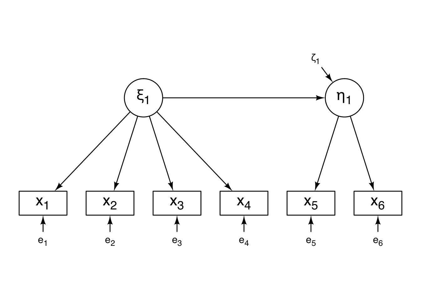
これでパス図が完成しました。
あてはめ
lavaanでモデルをあてはめて、標準化係数を表示します。
fit <- sem(model, data = cancer_data)
standardizedSolution(fit)
##     lhs op  rhs est.std    se      z pvalue ci.lower ci.upper
## 1   xi1 =~   x1   0.904 0.035 25.790  0.000    0.835    0.972
## 2   xi1 =~   x2   0.889 0.038 23.272  0.000    0.814    0.963
## 3   xi1 =~   x3   0.721 0.076  9.540  0.000    0.573    0.869
## 4   xi1 =~   x4   0.620 0.095  6.530  0.000    0.434    0.806
## 5  eta1 =~   x5   0.896 0.041 21.866  0.000    0.816    0.976
## 6  eta1 =~   x6   0.840 0.051 16.486  0.000    0.740    0.940
## 7  eta1  ~  xi1   0.981 0.036 27.158  0.000    0.910    1.051
## 8    x1 ~~   x1   0.184 0.063  2.901  0.004    0.060    0.308
## 9    x2 ~~   x2   0.210 0.068  3.100  0.002    0.077    0.343
## 10   x3 ~~   x3   0.481 0.109  4.418  0.000    0.268    0.694
## 11   x4 ~~   x4   0.616 0.118  5.230  0.000    0.385    0.846
## 12   x5 ~~   x5   0.197 0.073  2.688  0.007    0.053    0.341
## 13   x6 ~~   x6   0.295 0.086  3.445  0.001    0.127    0.462
## 14  xi1 ~~  xi1   1.000 0.000     NA     NA    1.000    1.000
## 15 eta1 ~~ eta1   0.039 0.071  0.545  0.586   -0.100    0.177
標準化パス係数を取り出しておきます。
est_std <- standardizedSolution(fit)$est.std標準化パス係数を記入したパス図
さきほどのパス図に、あてはめ結果の標準化パス係数を記入したものを作成します。
ggdiagram() +
  xi1 +
  eta1 +
  x[[1]] + x[[2]] + x[[3]] + x[[4]] + x[[5]] + x[[6]] +
  zeta1 +
  e[[1]] + e[[2]] + e[[3]] + e[[4]] + e[[5]] + e[[6]] +
  connect_fun(xi1, eta1, est_std[7], num_size) +
  connect_fun(xi1, x[[1]], est_std[1], num_size) +
  connect_fun(xi1, x[[2]], est_std[2], num_size) +
  connect_fun(xi1, x[[3]], est_std[3], num_size) +
  connect_fun(xi1, x[[4]], est_std[4], num_size) +
  connect_fun(eta1, x[[5]], est_std[5], num_size) +
  connect_fun(eta1, x[[6]], est_std[6], num_size) +
  connect_fun(zeta1, eta1, NULL, num_size) +
  connect_fun(e[[1]], x[[1]], NULL, num_size) +
  connect_fun(e[[2]], x[[2]], NULL, num_size) +
  connect_fun(e[[3]], x[[3]], NULL, num_size) +
  connect_fun(e[[4]], x[[4]], NULL, num_size) +
  connect_fun(e[[5]], x[[5]], NULL, num_size) +
  connect_fun(e[[6]], x[[6]], NULL, num_size)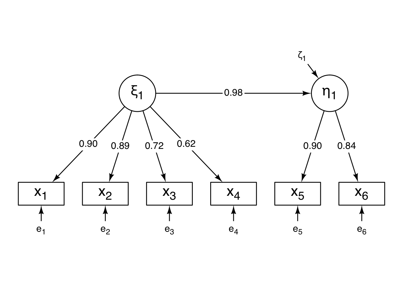
おわりに
これまで、Rでこのようなダイアグラムを描画するときはDiagrammeRを使うことが多かったのですが、これからはggdiagramをつかうようになるかもしれません。