## This is the global settings of a Shiny web application.#library(tidyverse)# Load the bear data from a parquet filekuma_data <-file.path("data", "kuma_data.parquet") |> nanoparquet::read_parquet() |># Select relevant columns and rename them for clarity dplyr::mutate(year =`出没年`,longitude =`経度`,latitude =`緯度`,type =case_match(`目撃痕跡種別`,"目撃"~"目撃","痕跡"~"痕跡",.default ="人身被害・その他"),comment = stringr::str_c(year(`出没日`), "年", month(`出没日`), "月", day(`出没日`), "日 ", htmltools::htmlEscape(`時刻`),"<br />",if_else(`森林からの出没`, "【森林からの出没】", ""),if_else(`河川からの出没`, "【河川からの出没】", ""),if_else(`誘引物が原因の出没`, "【誘引物が原因の出没】", ""),if_else(`繁殖・分散行動による出没`, "【繁殖・分散行動による出没】", ""),if_else(`大量出没年に特有の出没`, "【大量出没年に特有の出没】", ""),"<br />", htmltools::htmlEscape(`備考`) ),.keep ="none" )# Load the prediction dataprob_data <-file.path("data", "kuma_prediction.geojson") |> sf::st_read() |> dplyr::mutate(prob = pred *100) |># percent sf::st_transform(crs ="WGS84")# palette colorspal_colors <-palette.colors(n =8, palette ="Okabe-Ito")
ui.R
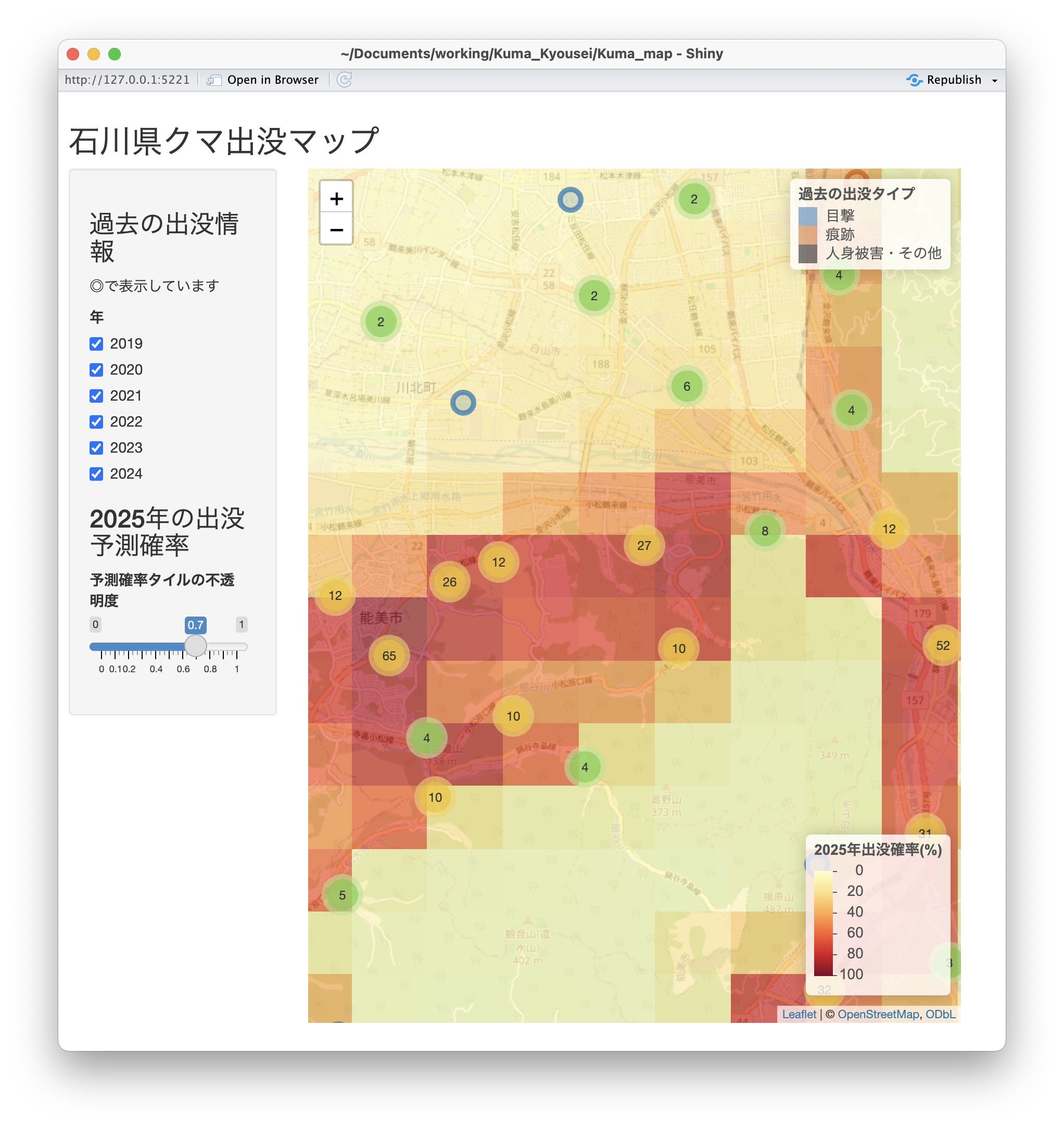
33〜46行目が予測確率表示のタイルの不透明度の設定です。
ui.R
## This is the user-interface definition of a Shiny web application. You can# run the application by clicking 'Run App' above.## Find out more about building applications with Shiny here:## https://shiny.posit.co/#library(shiny)library(leaflet)fillPage(# App titletitlePanel("石川県クマ出没マップ"),sidebarLayout(sidebarPanel(# label for past incidentsh3("過去の出没情報"),p("◎で表示しています"),# checkbox group for filtering by yearcheckboxGroupInput(inputId ="checkbox_year", label ="年", choices =as.character(2019:2024),selected =as.character(2019:2024),width ="95%" ),# label for predictionh3("2025年の出没予測確率"),#p("タイルで表示しています"),# slider for opacity of predictionsliderInput(inputId ="slider_opacity",label ="予測確率タイルの不透明度",min =0,max =1,value =0.7,step =0.1,width ="95%" ),width =3 ),# Show the mapmainPanel(# c.f. https://blog.atusy.net/2019/08/01/shiny-plot-height/div (leafletOutput(outputId ="map",width ="95%",height ="100%" ),style ="height: calc(100vh - 100px)" ),width =9 ) ),padding =10)
server.R
18〜32行目が凡例です。出没タイプは右上に移動し、出没確率を右下に持ってきました。
60〜74行目で出没予測確率を表示しています。
server.R
## This is the server logic of a Shiny web application. You can run the# application by clicking 'Run App' above.## Find out more about building applications with Shiny here:## https://shiny.posit.co/#library(shiny)library(leaflet)function(input, output, session) { output$map <-renderLeaflet({leaflet() |>addTiles() |>setView(136.6, 36.8, zoom =9) |>addLegend(position ="topright",title ="過去の出没タイプ",colors = pal_colors[c(6, 7, 1)],labels =c("目撃", "痕跡", "人身被害・その他"),data = kuma_data ) |>addLegend(position ="bottomright",title ="2025年出没確率(%)",pal =colorNumeric("YlOrRd", domain =c(0, 100)),values =c(0, 100),opacity =1,data = prob_data ) })# checkboxGroupInput is used to filter the data# and update the map based on selected yearsobserveEvent(input$checkbox_year, { proxy <-leafletProxy(mapId ="map",data = kuma_data |> dplyr::filter(as.character(year) %in% input$checkbox_year) ) proxy |>clearMarkerClusters() |>clearMarkers() |>addCircleMarkers(lng =~longitude,lat =~latitude,color =~case_when( type =="目撃"~ pal_colors[6], type =="痕跡"~ pal_colors[7],.default = pal_colors[1]),opacity =0.7,popup =~comment,clusterOptions =TRUE )},ignoreNULL =FALSE)# sliderInput is used to set opacity of the prediction layerobserveEvent(input$slider_opacity, { proxy <-leafletProxy(mapId ="map",data = prob_data ) proxy |>clearShapes() |>addPolygons(fillColor =colorNumeric("YlOrRd",domain =c(0, 100))(prob_data$prob),fillOpacity = input$slider_opacity,stroke =FALSE,popup =sprintf("%2.1f%%", prob_data$prob) ) })}